
Guidance on Designing & Implementing Form Labels

- Posted by: Michael Spellacy (Spell), Director, Accessibility
- Pronouns: He/Him
- Posted: Wednesday, April 6, 2022
- Update: Thursday, September 18, 2025
In an effort to improve the way in which Radancy includes form labels within its sites and products, this document seeks to introduce more clearly defined guidance that can be shared with all team members. Especially designers, developers, and QA engineers. Inclusion of a proper label is critical and allows more people to understand and use the form. Omission or poor implementation of a label is also considered a direct failure of Success Criterion 3.3.2 Labels or Instructions.
Label Placement Overview Anchor ()
Placeholder as Label Replacement
This is bad. Don't do it. Placeholder text, as seen here, is not a replacement for a label. Development will likely ask you to alter it with one of the two solutions below. Hiding a label with display: none is also terrible.
Floating Label
This is not much better (go ahead and click on it). Know the risks and use only as a last resort in your design work if it is absolutely required. While we can make an exception from time to time, the preference is to avoid this technique and include a label outside of the field.
Label Outside of Field
This is best. Simple and bulletproof and clear to all users, including those with disabilities. Can be designed in several different ways. Here, additional placeholder text can be added if desired, but see below details on when and when not to use placeholder text.
Code
<label for="overview-2">Keyword</label>

<input id="overview-2" type="text">
Rules Anchor ()
- All form fields must include a visible label. See exceptions.
- Placeholder values are not an appropriate alternative for labels.
- Placeholder values may not duplicate what is already found in a label.
- Placeholders may not be used with hidden labels.
- Placeholder values may only be used to provide supplemental or suggestive information.
- Critical information about a form field must always be placed outside of the field.
- Placeholder values must always be contrast friendly.
- Form fields should always look like form fields.
Exceptions Anchor ()
- Certain types of forms are so ubiquitous that they have become a common and well understood convention across the web. For example, a global site search that utilizes a single input field and button may not require a visible label.
- Certain types of information may have labels omitted if they are grouped together properly. See grouping inputs example.
Floating Labels: A Word of Warning Anchor ()
Including a visible label, often outside of the field, is always the best solution. If floating labels are a client requirement, please be aware of the risks they present before using in your design and present these risks to your client and fellow colleagues. Radancy would prefer not to see this technique used.
Examples Anchor ()
The following examples are meant to illustrate best (and poor) practices of designing form fields.
Note: The placeholder attribute used in some examples may not be included in some assistive technology/browser combinations. This is but one reason why we can't fully rely on it to stand in as a label.
Placeholder Values Are Not An Appropriate Alternative For Labels (Avoid)
While using placeholders as labels may seem like a great way to reduce visual clutter, placeholders and labels are very different things. Please familiarize with the numerous pitfalls of using placeholder text to stand-in for proper labels.
Assistive Technology
"Keyword edit blank"
Placeholder Values May Not Duplicate What is Already Found In a Label (Avoid)
Do not duplicate the label as placeholder text. Not only is this visually redundant, but assistive technology users may have to listen to it twice, too. Alternatives measures to fill in the empty space with similar text, because empty space may not be aesthetically pleasing, will be equally frowned upon (Enter your first name, Ex. John, etc.).
Assistive Technology
"First Name edit First Name blank"
Placeholder Values May Only Be Used To Provide Supplemental or Suggestive Information (Best Practice)
Placeholder text should be used to provide supplemental information. For example, formatting or suggestive hints are an ideal use of placeholder text.
Note: Please note that this is an example of suggested placeholder text. All forms are different, so please use formatting required by the system accepting the data.
Assistive Technology
"Phone Number edit e dot g dot 5551234567 blank"
Critical Information About a Form Field Must Always Be Placed Outside of the Field (Best Practice)
Placeholder text does have its limitations. If a field is pre-populated with data or a user begins typing, the placeholder text will vanish. A problem for people who have cognitive disabilities, to name but one group it may affect. If formatted or supplemental information is critical, then instructions should be placed outside of a field, where it will always be present.
Required format: 5551234567
Code
To convey this information to assistive technology users, use aria-describedby, which will append the message to the input field.
<label for="example-4-phone-number">Phone Number</label>

<input aria-describedby="phone-formatting" id="example-4-phone-number">

<p id="phone-formatting"><em>Required format: 5551234567</em></p>
Assistive Technology
"Phone Number edit Required format: 5551234567 blank"
Placeholder Values Must Always Be Contrast Friendly (Best Practice)
Default placeholder text, often a lighter shade of gray, can be hard to read in some browsers, so always aim for a color of #767676 on white backgrounds. The text must meet a 4.5:1 ratio or higher.
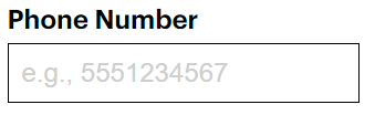
Note: Please also note that the form field itself must meet an acceptable contrast ratio of 3:1 with its background color. In short, interactive objects, like forms and buttons, must be able to be discerned as such.
Grouping Inputs Without Visible Form Labels (Exception)
In certain circumstance, traditional labels can be omitted, but should be grouped together via a fieldset. For example, three separate fields for a single date entry. In addition to the fieldset, we would include a legend as our primary label, along with aria-label to distinguish each field.
Note: This is not a technique we would use on a single search form, but to better organize groups of fields, within a complex form.
Code
<fieldset>

  <legend>Select Date (Month, Day, Year)</legend>

  <input aria-label="Month" placeholder="MM">
  <input aria-label="Day" placeholder="DD">
  <input aria-label="Year" placeholder="YY">

</fieldset>
Assistive Technology
"Select Date (Month, Day, Year) grouping, Month edit MM blank"
Form Fields Should Always Look Like Form Fields (Avoid)
While it can be tempting to uniquely design form fields to make them look less conventional, this can be a detriment to usability. Across the web, input fields are very similar to each other, so breaking common convention can cause confusion for some users. Including an outline around each field is always preferable.

What Happened To Text Inputs? Anchor ()
If you would like to watch a hilarious take on this issue, please watch this video: