
Radancy Component Library (RCL)
Access a library of modular components that seamlessly combine to assist in creating dynamic web interfaces. The library now includes 19 unique components, with over 128 examples to choose from.
Components Anchor (Components)
-

Accordion v2.9.4
Organize content into expandable and collapsible sections, allowing users to reveal or hide information as needed.
-

Animation Toggle v2.9.0
Allow users to pause or resume web animations, videos, or other dynamic content for improved control and accessibility.
-
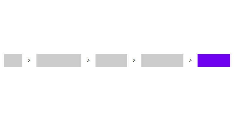
Breadcrumbs v1.1.0
Provides a navigational trail that helps users understand their location within a website's hierarchy.
-
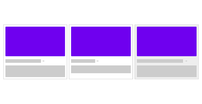
Card v1.5.0
Group content such as images, text, and related links, offering a compact and organized way to display information.
-
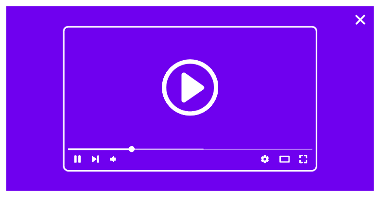
Dialog v1.2.3
An accessible, easy-to-implement modal for video and other content, replacing third-party components such as Fancybox.
-
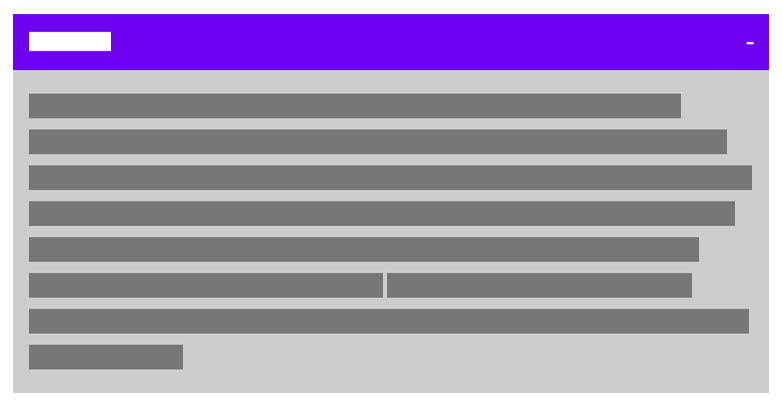
Disclosure v2.5.0
Reaveal or hide additional content when triggered, helping to manage the display of supplementary information.
-

Hero Banner (Image) v1.1.0
Highlight key content or messaging with a bold visual, featuring an image, heading, and call-to-action at the top of a page.
-
Hero Banner (Video)
Highlight key content or messaging with a bold visual, featuring a video, heading, and call-to-action at the top of a page.
-
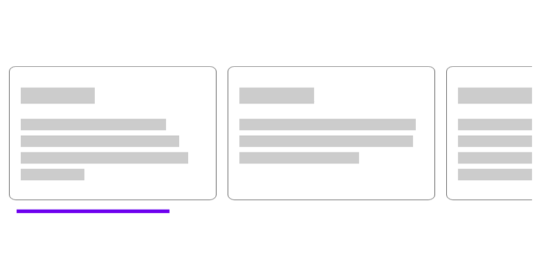
Horizontal Free-Scroller v1.5.2
Enables horizontal scrolling of content within a limited width, serving as a sleek alternative to carousels.
-
Load More v1.0.0
Allow user to reveal additional content by pressing a button to load more items dynamically.
-
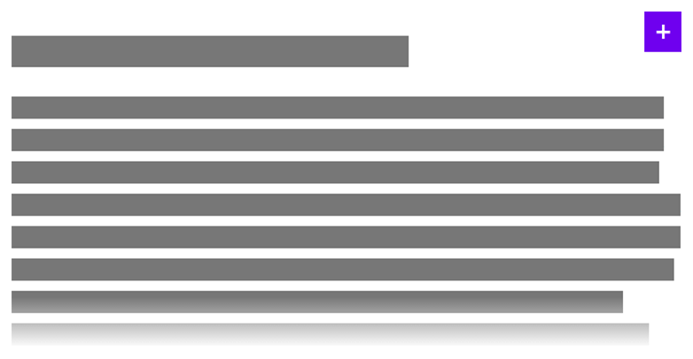
Partial Disclosure v1.7.0
Reaveal or hide partially visible content when triggered, helping to manage the display of supplementary information.
-
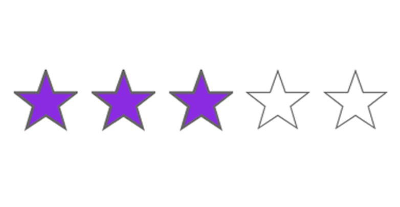
Rating v1.0.0
Allow user to evaluate content by selecting a rating, typically displayed as stars or other visual indicators.
-
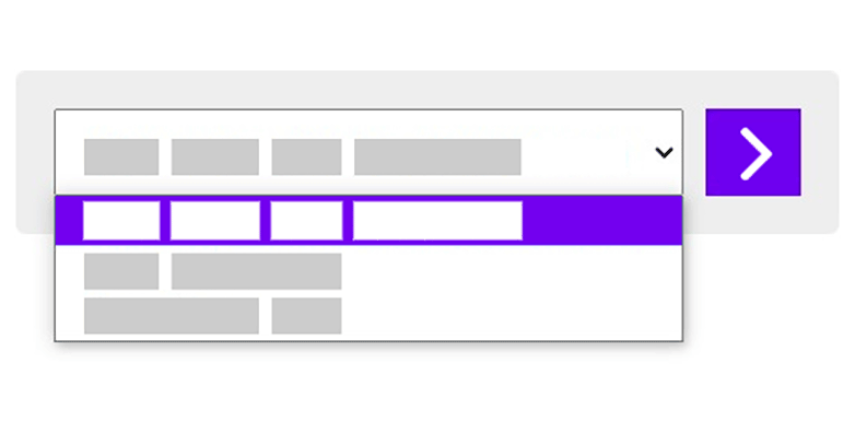
Select Navigation (External) v1.2.0
Allow user to choose an item from a select menu and navigate to a corresponding page.
-
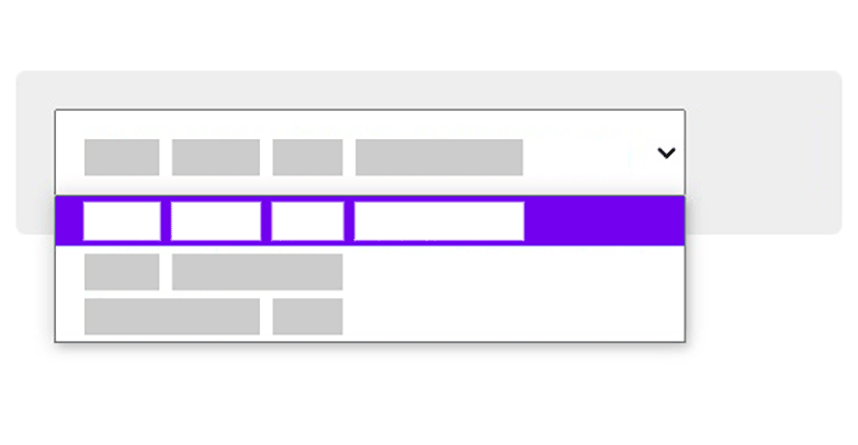
Select Navigation (Internal) v1.8.1
Allow user to choose an item from a select menu, updating the content on the same page.
-
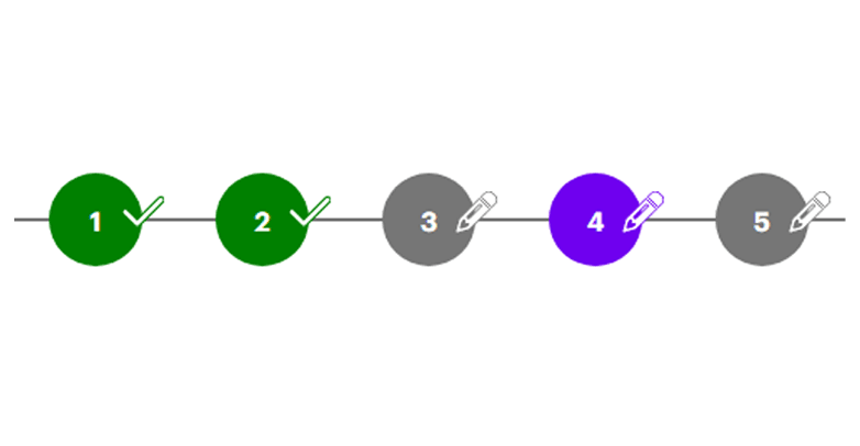
Step Indicator v1.0.0
Use the step indicator to show a user's progress in a multi-step process, commonly seen in forms or workflow screens.
-

TabList v2.0.3
Organize content into separate sections, allowing user to switch between them by selecting different tabs.
-
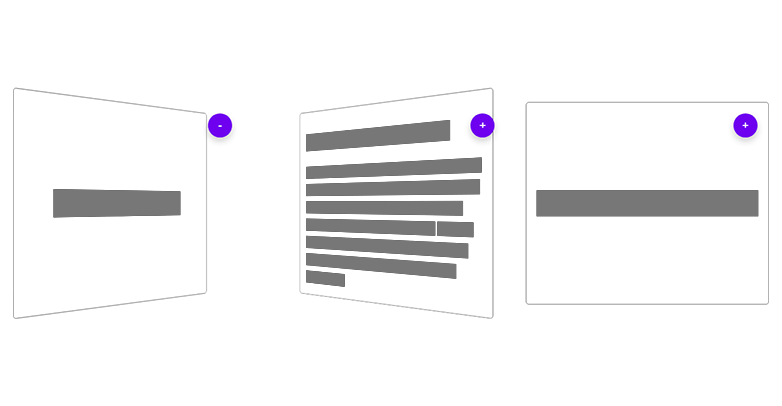
Tile v1.2.1
Group content in a visually organized layout, with the ability to flip and reveal additional information when a button is pressed.
Third-Party Anchor (Third Party)
-

Instagram Feed v1.2.9
Display a series of posts from an Instagram account, including images and captions.
-

YouTube Feed v1.0.0
Display a series of videos from a YouTube channel or playlist, including video thumbnails and titles.
Layouts Anchor (Layouts)
-
Advanced Job Details (AJD)
A boierplate system to produce Advanced Job Decscription pages more easily.
-
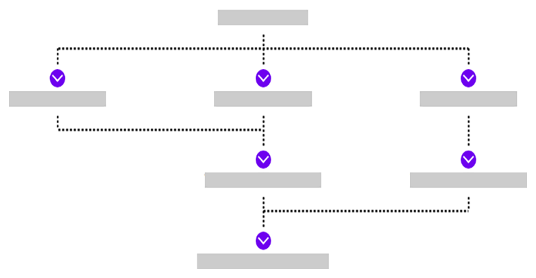
Career Path Generator (CPG)
A tool to help you easily produce career paths to be used in Advanced Job Detail pages.
-

FlexSpan Grid System (FGS)
A flexible grid system capable of various functionalities, such as optional pre-defining of rows, gaps, customizable breakpoints, and offsets in both directions.
Resources Anchor (Resources)
-

CSS Animation Library v2.0.0
Elevate your upcoming website design by incorporating these popular CSS animations.